Hire two designers, not one
Right now the market for designers is C.R.A.Z.Y.. Across all industries, across all disciplines, everyone is looking to hire designers. Every single one of our clients is looking to hire production designers. At least four of our clients at Rocket are looking for design directors. In fifteen years I have never seen design so much in demand.
And there are more designers than ever on the market. But, counter-intuitively, many companies cannot seem to hire even a single designer. Why is that? The answer is simple: Firms can’t hire designers because they have no design culture to begin with. They have no design environment to attract designers with. When companies say “You are our first designer and we want you to come in and lead Design” they believe it’s the pitch that designers want to hear. But they are really asking designers to work solo, without other designers, and without support. Without someone to review their designs. Without someone who understands the politics of design. Without someone to kvetch with. Without someone who understands fully what they do.
This designer will report to someone who is not a designer. They will present their work to stakeholders who work in a company *without designers*! Think about that…if you do not have designers already it says volumes about how you value design. If this is the case it is likely that your company does not have a healthy relationship with design. If you do not have a design team then you cannot, by definition, have a design friendly culture. It does not count that you have one or two non-designers who fancy themselves design-minded. (and it’s not in your interest to talk about yourself like that if you’re not a designer…designers recognize someone who will overrule them)
Designers typically don’t want to work alone. Yes, being the *lead* is great. But what designers really want is to grow and learn from other designers. It’s that simple. If you cannot give designers the opportunity to learn from other designers then your environment is not ideal.
Relative to what I’m seeing in the market, I have an easy time hiring designers. Why? Because when I bring in a potential hire I introduce them to a team of a dozen designers they can learn from! Designers immediately see this support network they didn’t have before and they know at the very least they will improve their craft, have others to learn from, and work with people with similar interests. One of my initial goals when introducing a recruit to the team is to find a specific designer who I think they will get along well with…if I can do this quickly then the hire is half done.
If you already have a big design team you know this…you know that merely introducing the new recruit to the team is the most powerful thing you can do. This blog post is not for them…this is for the product team who is struggling building a design team in the first place.
So, here’s a crazy idea: hire two designers instead of one. Don’t start off with a single designer. Hire two at once. Don’t hire that lone person and expect them to perform miracles alone. And don’t wait until you have a years worth of budget for two people. Invest! Invest in design by kickstarting your team with two people. They will have support of at least one other designer. They will have some feeling of being on a design team. They will likely start doing design reviews outside of regular product review meetings. Encourage this! Designers want and need other designers to push them in a safe space…before the work is shown around the company. They want more than anything to become better designers so set up an environment where they can do so!
There is a lot of advice out there about how to improve your recruiting process. Are our interview questions right? Should we do a design exercise or not? What order should things be? How do we assess a design portfolio? Etc. Those are important things to think about, but none of those things matter if you do not have a design culture to hire someone into.
Tactically, I realize this will be hard. But designers know designers. Start building a relationship with a single designer whose work is up to snuff and tell them that you have an amazing opportunity for them and a designer friend. Pay them well and see what happens.
(N.B. Even though I constantly talk about this with clients I’m publishing this on my personal blog b/c it is not official Rocket advice…)
1 hour of research saves 10 hours of development time
I was recently talking to a developer who was building out a new stream view for a web app she was working on. She was in the middle of getting infinite scrolling to work, which isn’t very hard for developers these days but it does take a significant amount of time to do elegantly. My experience has shown me that in most cases streams are not the best way to present information. In fact, outside of social apps streams are rarely useful.
So I started asking questions about what the stream view was for. Who was going to use it and what would they do with it? Very basic questions. It turns out that the stream view was just another view the team thought might be useful, but they hadn’t actually talked to any users to confirm that. I asked why. After a few minutes of my badgering the developer looked at me and said “You know, I think we just are assuming it’s valuable”.
Now, it’s possible that the stream view is a good addition to this app. That’s not the point. The point is that a very small amount of research could have confirmed whether or not this was a good idea. As it was, the team was spending 20 or 30 hours building this screen….a significant amount of developer time! And for startups it’s an even more critical amount of time…because it is potentially taking away from some other growth activity.
Not only that, but there are other costs. The time to maintain the screen going forward is not trivial. And any associated support time as well. But the biggest cost is probably the most hidden, and that is the cost of additional overhead in the product for the people who use it.
Every feature adds complexity to your product. Even if you hide the new feature on its own tab it is taking up valuable space, not only in the UI but in your user’s heads. You’ve added another option that they now have to decide between. For the first feature added…not a huge effect. Over time, however, enormous. Every subsequent feature adds more and more friction.
It’s not scientific at all but I’m now thinking that:
1 hour of research ~= 10 hours of development time.
Or, in longer terms if more people appreciated how one day of user research can save weeks of coding I think they would do it more. It is remarkable what you decide to not build after talking to a few people closely. And it is remarkable how much you can learn from just asking a few questions or showing a mockup to a couple users. I have a background in usability and design, so I’m biased, but it’s basically just being curious and asking questions. Anybody can do it.
So if your hammer is the ability to code, don’t just hammer everything in sight. Ask a few questions first. Take an hour or two to make sure you’re building the right thing.
Tips on how to hire a good designer
It seems like everyone is hiring designers! They’re hiring product designers, UX designers, creative directors, directors of design, UI designers, visual designers, etc. There are even acquihires of entire design teams! So…how do you find a good designer?
First, a quick backstory for people who have never read my blog before. Until this past August I was the Director of UX at HubSpot, a SaaS marketing company here in Boston that went public in October. So for three years (in which HubSpot was growing quickly) I was the hiring manager for product designers and UX specialists. There is nothing I did at HubSpot that I am more proud of than the team I hired there. This article contains a bunch of tips from that experience.
Always be building relationships. The best strategy to take when looking for designers is to always be building relationships with the best designers you know of. This is not typical “recruiting” (which is too often about trolling LinkedIn and sending cold emails). This is building relationships through personal interaction with designers. I know…I just made the task way harder! Always be recruiting, even if you don’t have an open job posting. Go to design meetups and just talk to designers about what they’re working on. Email someone with a killer shot on Dribbble a heartfelt compliment without expecting anything in return. Ask who is doing great work. Ask for intros to friends, etc.
Portfolio, portfolio, portfolio. Education is fine. Experience is fine. Job titles are fine. Talk is cheap. The portfolio is what really matters. Can this person do the work you need? If your goal is to hire a junior designer and grow them you can overlook a smaller but promising portfolio if they have everything else you want. But if you want someone to step in on day one and get the job done, you need to see something in their portfolio that is already at the level of what you need. Have they built a similar product before? Don’t let someone with a great personality fool you…if they cannot show you great work and tell a compelling story about it then they will not be able to do that on the job. Frankly I don’t care if you have any education or degree…if you have the chops it doesn’t matter how you got them. My favorite portfolio ever was a single white page, beautifully designed, containing only text and an extremely focused message about why this person was the right fit for the job. They had thought about exactly what that page was for, how it should be designed, what it would be used for and by whom, and was just as effective as a dozen screenshots on some portfolio site.
Can they tell a story? Storytelling is a crucial skill for designers. First, can they tell a compelling story about the pieces in their portfolio? About why a design is a certain way and not another? Can they connect the design they ended up with all the way back to an initial problem they’re trying to solve? This doesn’t mean that they’re captivating soothsayers with amazing voice inflection, but they need to be able to narrate the lifecycle of their users and show how they solve for it in their design. Or do their stories fall apart and have logical gaps? This is important in hiring but also on the job…if a designer can tell a story then they can convince others that their design is the right one, that research is important, that they’re solving the right problem. I’ve seen some fantastic visual designers who just couldn’t tell a story and who ended up always designing for themselves…beautiful things for themselves.
Are they designers all the time? Some people do design as a job and nothing more. Some go into work and design from 9-5, collect their paycheck, and leave. They can do good work this way. The best designers I know, however, are never not designing. They’re thinking about it all the time, they’re working side jobs, they’re getting emotional about their favorite products latest update, they’re designing products in their spare time, they’re never not thinking about it. These are the passionate people and the ones you want.
Know what motivates designers. It’s interesting to me how often I talk to folks who are trying to hire designers but who aren’t emphasizing the right things. You need to know what motivates designers in order to hire them. If I had to rank designer motivations generally it would be something like: Always be learning (from great teammates), cool/tough problems, fun/flexible culture, room to grow professionally, compensation/benefits. Note that compensation is last on the list…that rang true every time for me. When I would get into discussions with designers who were focused on how much money they were going to make it was never a good fit…even if I could pay them more than what they were asking. Money is not what good designers are motivated most by.
Understand their current pain. In addition to knowing what motivates designers generally, when interviewing designers I would try to understand what their current pain is or what they’re not getting in their current job. If they’re at an agency it’s probably that they’re not talking to and getting direct feedback from users or that they’re considered just visual decorators. If they’re at a startup they are probably by themselves without a lot of support (and working crazy hours). If they’re at a big company they’re probably not being challenged or are feeling like just another cog in the wheel. By understanding the dynamics of their current situation you can better position your job to them as a solution to their current frustrating situation. You gotta sell! It turns out this is an easy thing to find out, just ask: “what is frustrating about your current job?”. (You usually don’t have to ask…people are always talking about what’s frustrating in their jobs)
Ask anyway. It’s easy to assume that people aren’t looking if they’re not updating their LinkedIn profile or posting to Dribbble. But people don’t mind being asked if they’re interested in talking. If someone was adamant that they were happy in their current position (couldn’t be poached), I would say “Well, if you do reach a point where you’re considering leaving, I can get you in for an interview immediately”. This makes it clear that you’re interested in them. This also sometimes accelerates their leaving…because now they know there is an opportunity ready and waiting for them. (Looking around is work for designers…if they’re happy they probably aren’t looking or actively considering other opportunities)
Have them hang with the team. One of the best changes we made to our hiring process was to have the design candidate meet and hang out informally with the team *before* an interview. This has several positive effects. One, it allows the team and the candidate to assess each other outside of the tight schedule of an interview. Second, it makes the interview much less formal and puts the candidate at ease…if they’ve met the team before the interview they are much calmer and more effective during the interview. To do this well means that as the hiring manager I was meeting with each candidate before they would meet with the team…so I was acting as a strong early filter. This is worth it. Just meeting with the team meant that I was already pretty positive about them and thought it was worth taking that step.
Do design exercises. Another critical part of our hiring process was refining the design exercises we did during an interview. This allowed us to effectively assess the problem-solving skills of candidates and allowed us to compare designers against each other effectively. You can get a good sense of someone’s visual design skills from a portfolio but it’s often harder to discern problem-solving skills that way. (not enough designers spend the time to really show design thinking in their portfolios!). There are also people who put pieces in their design portfolios that aren’t *really* theirs…and having them do design exercises forces them to show their stuff.
Do recruiting yourself. It is tempting to offload candidate searches to recruiters (in-house or headhunters). Don’t offload completely. Instead, use recruiters as channels for finding potential candidates and as quickly as you can build the relationship yourself. This builds trust in your candidates and lets them know you’re serious about their work and the possibility of them working for you. You can let recruiters do non-contact screening but I like to do any other screening myself (e.g. phone screens or coffees).
Reach out yourself. The recruiters at HubSpot were amazing, but without exception it was always most effective when I would personally reach out to design candidates myself and tell them that I was interested in their work. Don’t say “We’ve got a job that you should apply to” say “Hey I like your work and would like to meet you”. If you really mean it (and you should) you’re much more likely to actually get that meeting. Designers hate worst of all dealing with recruiters instead of the hiring manager. The best recruiters know this and work with the hiring managers to make it their relationship quickly.
Trust your gut. The more I recruit the more I’ve learned to trust my gut. In those few times when I didn’t trust my gut, I regretted it later. This might be self-fulfilling (I don’t know) but if you’re the hiring manager it’s your ass on the line when you choose to hire someone so you better be confident that it’s going to work. Even if you can’t articulate why your gut is saying No it’s still a signal you should listen to.
Trust your team. We interviewed one or two candidates who I thought were a good fit but not all designers on the team did. We often agreed but in this case we didn’t and I had to make the choice to not hire. I still think those candidates may have worked out but if I had hired them despite the judgment of the team the signal sent would have been negative. It’s one thing if the team is on the fence about a candidate and you’re the tie-breaker, but when they’re not into the candidate it’s just better to pass.
Can they critique/take criticism? One skill that applies for nearly every kind of design job is the ability to critique others and to accept criticism well. If a person isn’t good at this then I immediately pass. (they might have a solid portfolio but if they can’t work with others it doesn’t mean shit) An inability to critique/take critique means that they’re not able to fully design for others. In general designers need to get over themselves and that means they can clearly communicate without getting emotionally involved in the specifics of their work. And designers who can give objective criticism to others are valued like gold by their peers.
Be nice when saying no. When you’re in hiring mode you’re essentially working two jobs: your regular job and the extra job of hiring someone. It’s crazy and exhausting. That’s why its easy to skip over niceties like responding to everyone who inquires or everyone you say “no” to, and letting the recruiting team do it for you. I was pretty good at responding to everyone I should have but I really regret the two or three who fell through the cracks for one reason or another. What I learned was that even if the candidate is not a fit it doesn’t mean your job is over or that you don’t want to just end the relationship. It is very possible to say no and stay on extremely good terms with that person and end up working with them in the future.
Conclusion: Hiring designers isn’t easy but it isn’t black magic either. It’s mostly about building relationships, doing the work yourself, and having a process that introduces them to your team and company well. If you are able to keep the focus on the designer and their work then you’ll be able to find the right one for your company. It may not be a fast process but it’s worth the effort to find a candidate who really syncs with you and your mission.
Further reading:
- How To Hire The Best Designer For Your Team by Braden Kowitz
- How to hire designers by Paul Adams
- Who I hire by Cap Watkins
- Understanding UX skills by Irene Au
- Designing the team by Lindsay Mindler
- How to hire a product designer
- An inside look at Facebook’s method of hiring designers
Does Apple care any more?
Marco Arment, in his recent post Apple has lost the functional high ground:
“But the software quality has fallen so much in the last few years that I’m deeply concerned for its future. I’m typing this on a computer whose existence I didn’t even think would be possible yet, but it runs an OS with embarrassing bugs and fundamental regressions.”
After hypothesizing that Apple’s priorities are out of whack, he writes:
“I fear that Apple’s leadership doesn’t realize quite how badly and deeply their software flaws have damaged their reputation, because if they realized it, they’d make serious changes that don’t appear to be happening.”
Marco’s post is remarkable, for several reasons. First, he says he regrets writing it. I know how he feels…I’ve written posts that had too much bluntness and not enough tactfulness and felt bad about it. But I think there is a deeper story here that is about more than software vs. hardware or even reputation. I think it’s really about trust.
Forget for a minute whether there are more bugs than usual in Apple software or if things just don’t work seamlessly. Those are merely symptoms of the real issue…people equate product quality with how much a company cares. Think about it…the vast majority of our experience with Apple is through our experience with their products. That’s the bulk of our relationship with the company and so when those experiences aren’t as great as we expect we can only conclude that people at the company don’t care as much as they used to.
Apple is a complete anomaly in this regard. They have built such good products for so long that people just assume that they care. You can’t build such beautiful things without caring. Good design is no accident. This is so, so different from almost any other company out there! If any respected writer were to write posts about how Comcast or Monsanto or Microsoft doesn’t care there would be zero controversy (even though I’m sure there are people who care at those companies). But their voices aren’t heard because our experiences with those company’s products speak instead. Those companies haven’t put customers first for years and we stopped caring a long time ago.
Marco gives Apple the benefit of the doubt and suggests they just don’t see how bad it has become (and if they knew they would change course) He’s assuming they care. I think they care, too. But the possibility that they don’t care is the real fear here. We want Apple to care. We know they can care. We want a company who actually cares because almost every other company doesn’t. But if our experience is deteriorating…does that mean they don’t care anymore?
Here is the takeaway: Your product communicates how much you care. The user experience people have with your product is translated in their minds into how much you care about them as a customer. And people want to do business with companies who care. We look for signs that they care, whether it be how we’re greeted at the coffee shop, how a company packages their products, how salespeople treat us, how their Genius Bar geniuses help us, or how easily our Apple TV works with our iPad. The entirety of the user experience matters because of this. The best feeling is knowing that even if a product doesn’t work 100% you’ll be taken care of because you know the company cares. That is what is at stake here: the erosion of trust.
I’m not just hypothesizing. I recently learned this lesson the hard way on the Daily Report. This past summer I added humidity-level to the report to communicate how humid it was going to feel on a given day. Humidity is an odd metric…it doesn’t translate directly to a percentage of water vapor in the air…and in the summer it actually makes sense to use dew point as measure of humidity. Here is what the UI looked like:

For several months the feature worked well and I regularly received feedback of “humidity reading is helpful”. Many people even liked the reminder to drink more water. But then fall came and temperatures dropped. Over a month or so I heard a couple complaints about the humidity level not being quite right. I checked into it but it was working well enough…it was accurately displaying the level of humidity based on dew point. I didn’t change anything because I had a mountain of other things to design and nothing was technically broken.
But then in October I received an unsubscribe notification in which someone wrote: “I don’t think I can trust the weather report anymore. It seems inaccurate…I mean the other day the humidity level said ‘Dry’ when it was actually pouring rain outside”.
Uh oh. The inaccuracy of the humidity level was the trigger for someone unsubscribing from the service! But notice that it was really about trust…the humidity level eroded their trust in the entire service! That was a hell of a lesson to learn. I mean…nothing was technically broken, right? There was no “bug”. Up until that point I had responded to folks who asked about the humidity level and I told them that I was using dew point and I would adjust at some point soon when I redesigned the entire weather view. They totally understood and everything seemed fine.
But…everything wasn’t fine…the user experience was broken. The inaccurate feature was communicating that I didn’t care about the weather report or the people who used it. The product was standing in for my relationship with subscribers…in the exact same way that we ascribe caring to Apple based on our experience with their products.
This is all hard because we’re usually not witness to the moments when people actually use our products. We can do usability testing, provide feedback mechanisms, interview people, etc, but we’ll always be subject to the experience people have with our products when we’re not there. So even if you don’t have feedback telling you something is wrong (or bloggers like Marco writing about it), get obsessive, even paranoid, about how those experiences are playing out. You never know what small trigger will plant the idea in someone’s head that you just don’t care anymore.
Since I learned that lesson and fixed the humidity reading I’ve been much more pro-active in fixing other things on the report. And feedback has reflected this, people notice the tiniest of things I’m fixing. The lesson for me has been…whether or not you’re getting feedback people do notice the small things, the details. They see some small detail done well and they know you care. They see some small thing out of place and start to wonder if you care. Take advantage of this: be maniacal about the details.
In detail: Designing in context for mobile
I’m noticing an interesting practice emerging when designing for mobile: in-context messages that help you learn or give feedback about an app. Here’s an example:
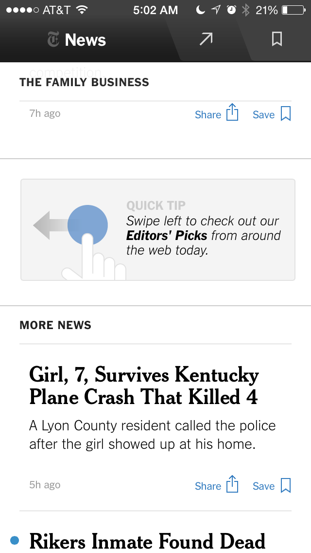
In this example from the New York Times Now app, the designers have dropped in a “quick tip” to let you know that you can swipe left to discover new content in the “Our Picks” section. Swiping in this way does the same thing that tapping on the arrow in the nav bar. This is a really nice way to let people know something, in this case that an action is available.
(That said, I think it could be argued that this action should be more easily-discoverable in the first place. It’s not clear that the arrow at top is a tab…the shading is very subtle and the arrow icon seems more like a share button. Simply labeling the tab “Our Picks” would be helpful)
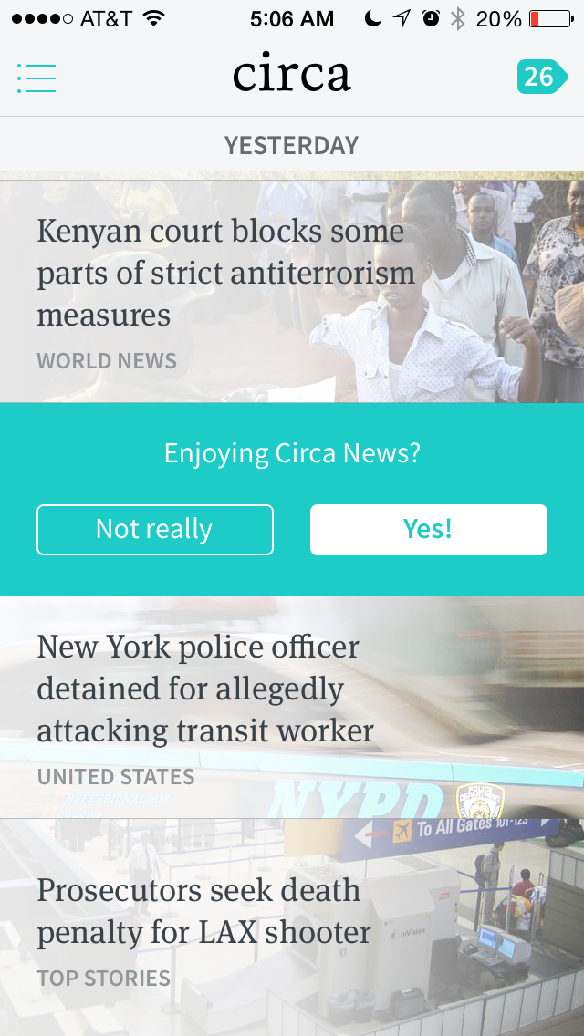
In this example from the Circa App the designers have embedded a feedback question directly in the news flow that is the main interaction in the app. This is a great way to gather feedback from people who use the app *while they’re using it*. This gets around several problems with gathering feedback, namely the problem of asking people outside of their normal use or at the wrong time.
That said, I do find myself not answering the question in many cases, however. I wonder if engagement would increase with a non-committal answer like “Meh”. I find that lately I’ve been pretty feeling Meh about the app…not a real strong feeling either way. I think it could be argued that asking for a binary answer will give cleaner feedback, but a feeling of “meh” is still very instructive…it means that the person is only have a mediocre experience. The Circa designers follow up an answer by asking for more feedback, and then make it clear that they won’t ask again, a nice touch.
There are several caveats when thinking about this type of UI element. First, this technique can be easily overdone. If you inundate users with this technique it will quickly take away from a positive experience with your product. Best to use this technique sparingly and only when you’re sure you’re adding value. (Twitter, for example, is getting close to this threshold by embedding unexpected content into your Twitterstream annoyingly) Second, this technique shouldn’t be a crutch used to overcome some UI or product deficiency…if you can solve it by designing something more clearly (which may be the case in the NYTimesNow app) then try that first.
I wrote more about gathering feedback in my most recent post on Square: In detail: Square’s email receipt and feedback flow
In detail: Square’s email receipt and feedback flow
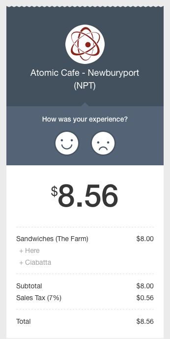
Since paper receipts aren’t very useful these days, I’ve been choosing recently to have my receipts emailed to me. The other week I filled out my email address on a Square checkout device at my local coffee house (Atomic Cafe) and didn’t think much of it. But when I read the email receipt later I noticed that the Square designers had very nicely embedded a feedback flow into the email.
Nice UI details:
- Feedback is embedded into the receipt. This has several positive effects. First, it ties the feedback to the actual transaction that the person just had and not some amorphous “experience with the company”. This will get you much better, detailed feedback because it focuses on a specific experience with the company. Second, it asks you at a time when you might be ready to give feedback, after you’ve had the experience. For experiences that take time (like enjoying a coffee or sandwich) there is no perfect time to ask. Attaching the question to the receipt seems like as good a time as any.
- The copy is friendly and efficient. How many surveys have you been solicited for that start out with something like “Would you like to take a survey? It would help us blah blah blah”. Most survey copy is not approachable and focuses on the hurdle of interrupting people for an answer. (it’s right that it is interruptive, but not helpful in copy). Instead, because this copy is in context, they skip right to the question: “How was your experience?”. It’s obvious that this is a survey! The smiley faces are approachable and obvious.
- The receipt looks like a receipt. Paper isn’t useful to have, but it makes sense to make this email look like a paper receipt to help communicate what it is just slightly more quickly. This takes advantage of our experiences with receipts. As paper receipts go away, one day this might not work.
- The company is primary, not Square. Square’s branding is very minimal here which reinforces my relationship with Atomic Cafe. I could easily see Square or a similar company mentioning themselves in order to build mindshare that they are the underlying technology. By keeping the focus on my relationship with Atomic Cafe the experience is better.
Problems with typical feedback surveys
Gathering feedback by embedding it into the receipt gets over a couple familiar problems with surveys. The most typical problem with surveys is that they are one-time mechanisms…they are typically sent as blast emails to a large group of people at a single point in time. They can gather extremely valuable feedback, but tend to have low response rates because they aren’t in context like in this receipt. And because they aren’t in context, it quickly gets annoying to send survey requests often…customers quickly tire of being asked. The data is also less useful in a typical survey because it’s usually generalized to your “overall experience” with the brand…not the experience of a specific transaction.
Typical survey feedback is also tied to where your product or experience is at the time of the survey. By tying the feedback mechanism with the receipt and making the feedback about this transaction, the data received with Square’s flow is more valuable than a generic survey because you know when the moment the experience happened (date/time of the receipt). Gathering ongoing feedback in this way is much more valuable than one-time surveys. You always have new feedback to respond to that is up-to-date.
Get better feedback by focusing on specifics
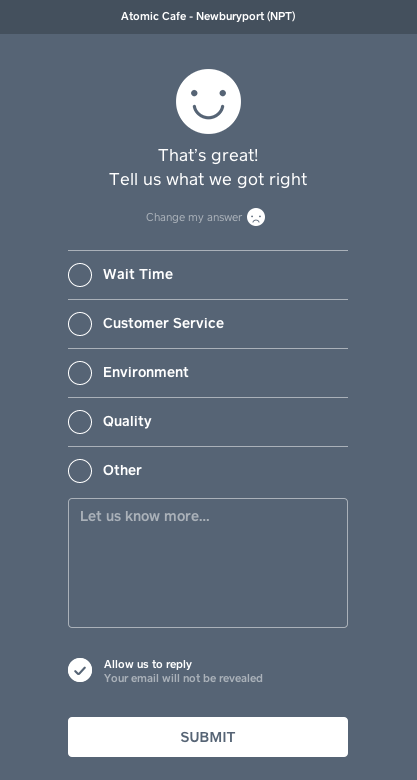
The subsequent screens of this flow are also nicely designed. When you give positive feedback (by clicking the happy face) you get a screen asking for more details about what you got right. This is great copy. Instead of saying “Give us more detail” or “Could you elaborate”, it asks for details about that specific experience. (in general asking for specifics is always more powerful than asking for generalities). The phrase “What did we get right?” frames the question nicely by focusing your attention on specific elements of the interaction that went right. Having answer categories also allows the business to get consistent feedback about specific topics that they want to know about and look for trends over time.

When you give negative feedback (by clicking the sad face) you get a very similar screen that asks for details in the same way. “Tell us what went wrong” is really nicely worded and acknowledges there was a problem. Again, the same copy technique is used to gather details about the transaction by focusing on specifics, not generalities.
Another nice detail
Another nice detail with the Square email flow: Once you enter your email address once, you’ll start getting email receipts from all the vendors you transact with who use Square. Since I gave my email address a couple weeks ago, I’m no longer asked if I want my receipt, Square automatically emails it to me and cashiers simply say “Ok, we just emailed you your receipt”. This saves everyone a little bit of time. Additionally, I found out that Square doesn’t share my email address with the vendor without my permission (even though each vendor now emails me my receipts). This is a nice privacy touch.
Because of all of these small details, Squares design here is really powerful, gathering specific feedback over time to companies who use the service. By focusing on gathering feedback in context the experience is easier for every party involved, and helps the business improve their product over time.
The problem with “we’ll fix it later”
I was talking to a design team yesterday and one of the team members casually mentioned that they were launching something new. I took a quick look at what they were planning to launch and it was clear that something wasn’t quite right…there was a weird UI bug and some data looked off. So I pointed those things out and was told “Oh yeah, we know. We’re going to fix it later”.
Those words, so subtle. I’ve said them many times. I’ve had the exact same attitude at a release. But the more I hear them the more I realize they’re deadly. Consider the negative effects they have:
- Your customers get a lower quality product. You know it and they know it, and so what are their expectations going forward? They’re going to be lower, and that’s a slippery slope you don’t want to start down. Release quality sets expectations.
- Almost as importantly you send the wrong signal to the product team. By putting out less than your very best product, you’re saying it’s OK to do less than your best work. This is poisonous. You might not see the effects in the short-term but the long-term effects of this sentiment cannot be understated. In effect you’re creating a culture where it’s OK to do mediocre work.
- You’re accruing product debt. No product team that I know of gets done a release and doesn’t have a whole list of things to work on next. There is always at least a backlog of next features to work on so it’s never as simple as fixing the things you couldn’t before release. And many, many times the small things that were released with the promise of being “fixed later” don’t actually get addressed at all…some issues never get fixed!
I’m a big believer in the power of words and the words “we’ll fix it later”, while seemingly innocuous, are actually preventing you from releasing the very best product you can. So the next time you hear them push back hard and realize that if there is something worth fixing it’s always better to fix it before release rather than after. The real signal that you’re following this idea is when you actually delay a release because your product is not the best it can be for your customers.
Growing from 10 to 100 to 1000 users
Lots of folks I talk to about building products want to know how to grow from a tiny initial user base (10 people) up through 100 to 1000. It certainly seems like each of these stages is different, but it’s not clear why. I recently thought a lot about this when interviewed by Jay Acunzo of Nextview Ventures. My take is that the reason why these are fundamentally different stages is because of the relationship you have with these people…in short it comes down to bias:
“Initially when you start, you can talk to friends and get them excited about what you’re working on. These people are your co-workers, friends, and family so they’re easy to find and talk to. But they are also completely biased…”
We also touched on a lot of other topics like what features to build, when to focus on product vs. growth, etc. Here is the entire interview.
Great idea, poorly designed
Rob Go of NextView Ventures makes a great point: saying “It’s been tried before” is a bad excuse to dismiss a product or startup.
Rob says:
“I’ve said those words before as well, both directly to entrepreneurs as well as in our internal conversations about companies. But I’m convinced that “it’s been tried before” is a terrible way to dismiss a startup idea. The reason is that this statement allows you to be way too intellectually lazy. It essentially says “… I’m just going to assume it won’t work because others before it failed.”
Rob says that there are two reasons for not dismissing companies like this: technology changes over time and most companies fail as a rule. I’ll add third reason to the list: Many ideas fail because of poor design.
There are countless great ideas out there that never see the light of day because they have never truly been realized in a product. Take, for example, 95% of the mobile apps you’ve ever downloaded. A promise of a good idea got you to download it, you may have even been excited to download it, but when you actually used it it was disappointing.
Design is hard. There are always constraints, trade-offs, and choosing which ones to hold to is extremely difficult especially in the startup environment where you just don’t have a lot of time. You’ve got investors and friends urging you to go faster, you’ve got customers who are asking for the world, and you’ve got your own pressure to be a success as fast as possible.
Sometimes great design just takes time. Sometimes it takes looking at an existing market and redesigning it right. The entire Apple product line is a testament to this. MP3 players existed before the iPod. Mobile phones existed before the iPhone. And many digital watches existed before the iWatch. Apple is never first into a market, they are always late. They come in with great design and get an immediate foothold.
Apple is just one example. Look at Slack and the communications apps. Look at Instagram and picture sharing apps. Look at WhatsApp and texting apps. Look at Sketch and the UI design apps. Look at Evernote and note-taking apps. Look at Dropbox and backup apps. Etc… All of these categories are littered with failed startups who created clunky, poorly designed user experiences while working on what turned out to be good ideas.
Apple is different of course because they have time on their side…they can R&D as long as they want to be sure that their product is amazing at launch. This is the greatest benefit of having so much money in the bank…they can release products on their own schedule. Startups do not have this luxury.
The big challenge for startups is time. Startups are under extreme pressure to make something work quickly. That’s why so much discussion about product development is about learning from customers and not wasting time marketing until you have product market fit…because until you do it means that your design is failing…even if you have a great idea.